portfolio highlight
OAK GROVE MONTESSORI
OVERVIEW
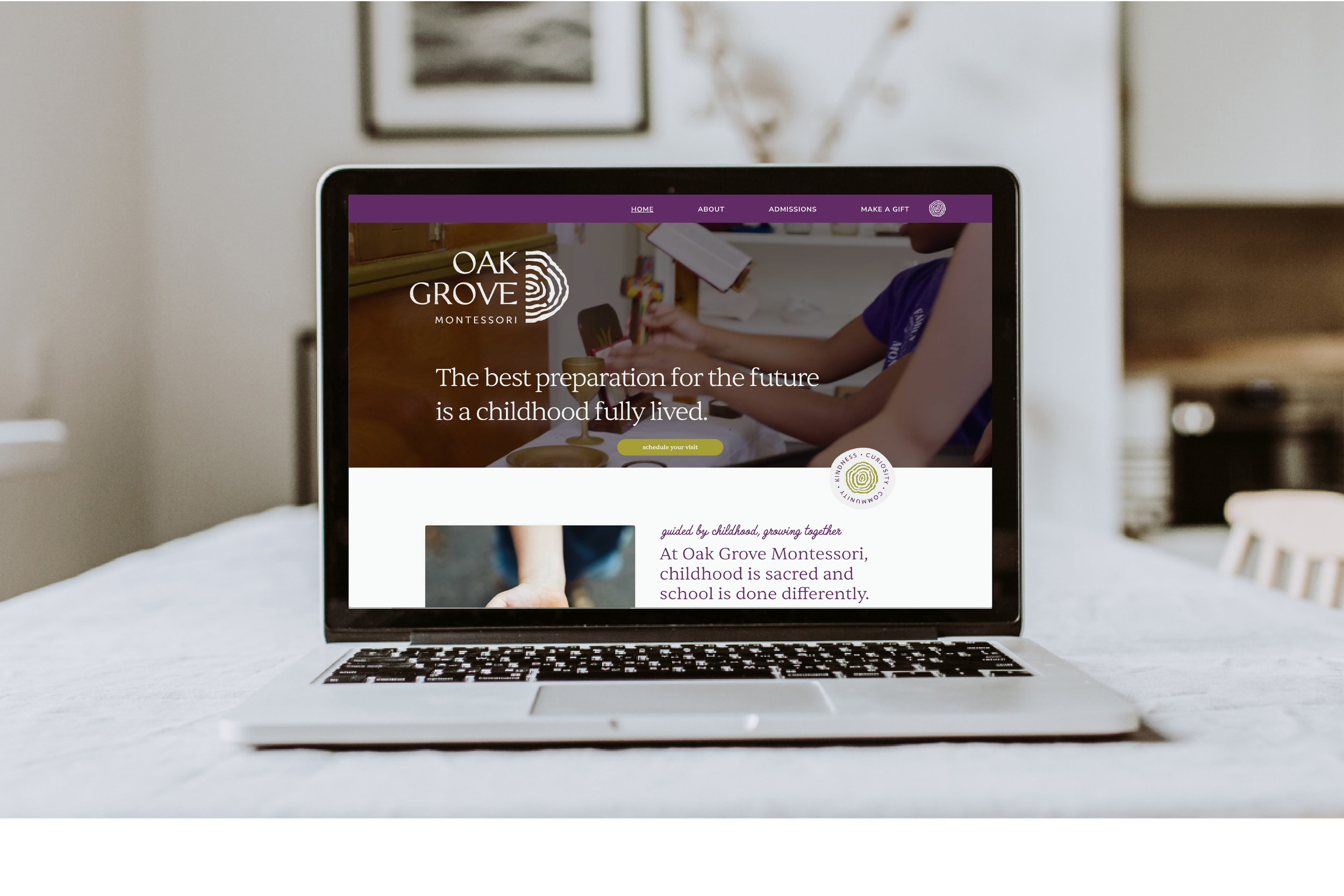
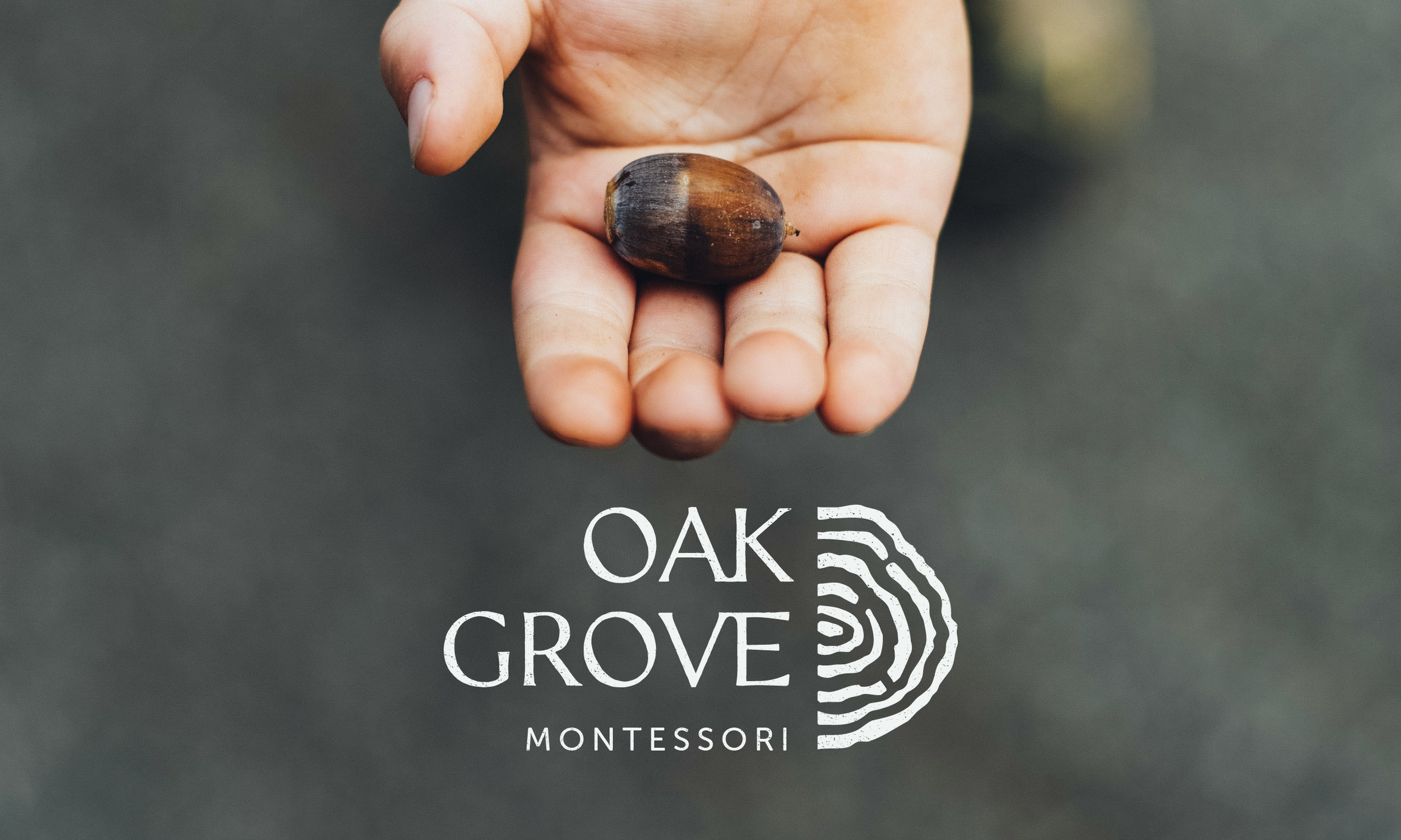
Oak Grove is an established DC-based Montessori school entering a new chapter with a new name after 45 years as a beloved institution. They needed a brand that could honor their history while expressing the warmth, curiosity, and connection at the heart of their community.
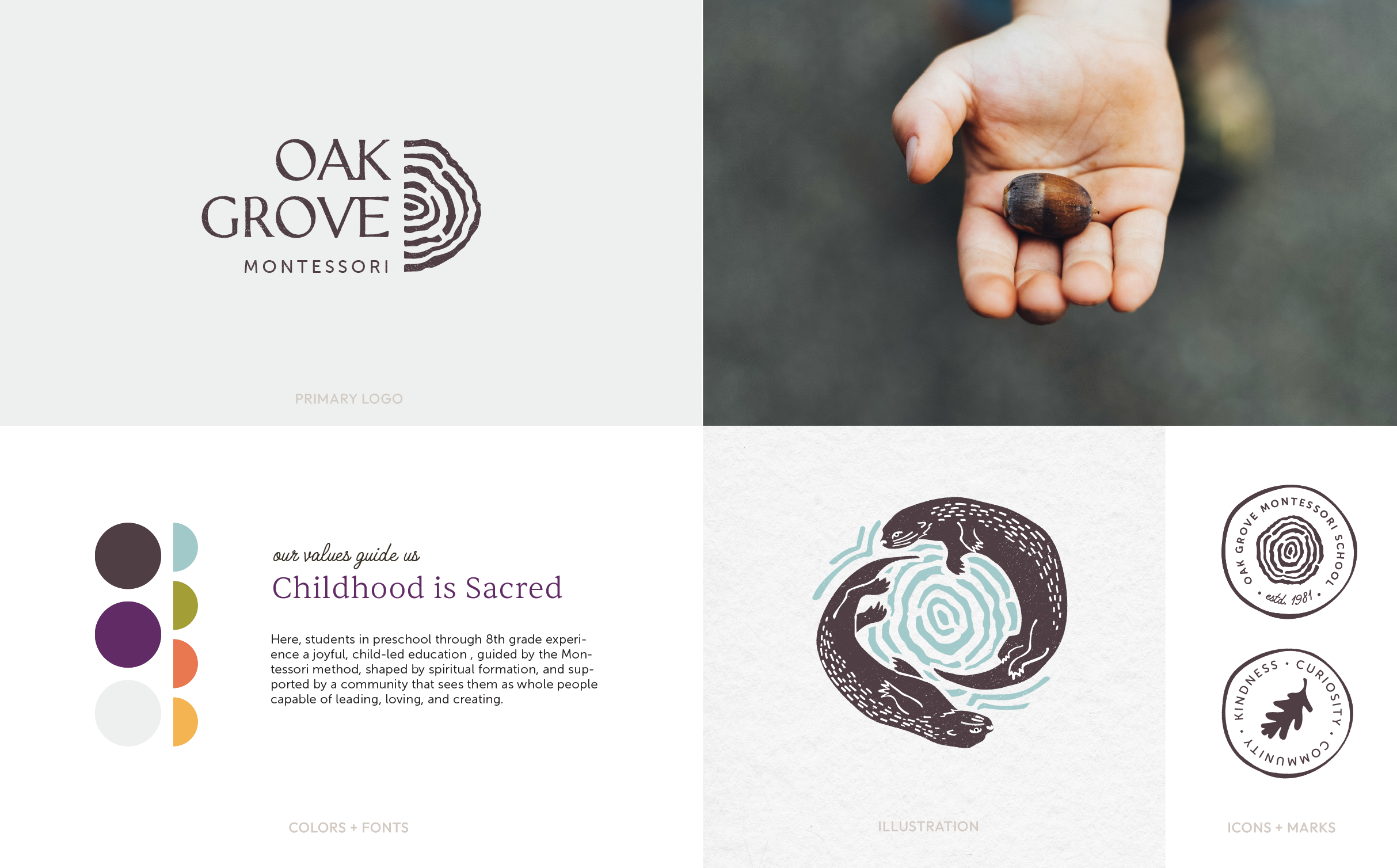
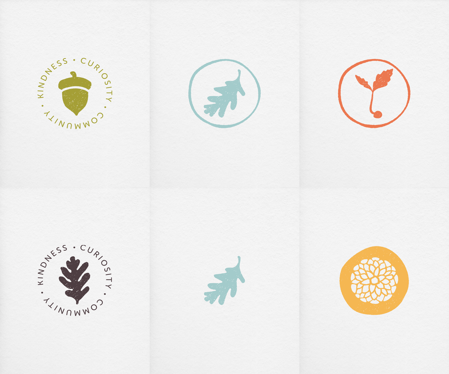
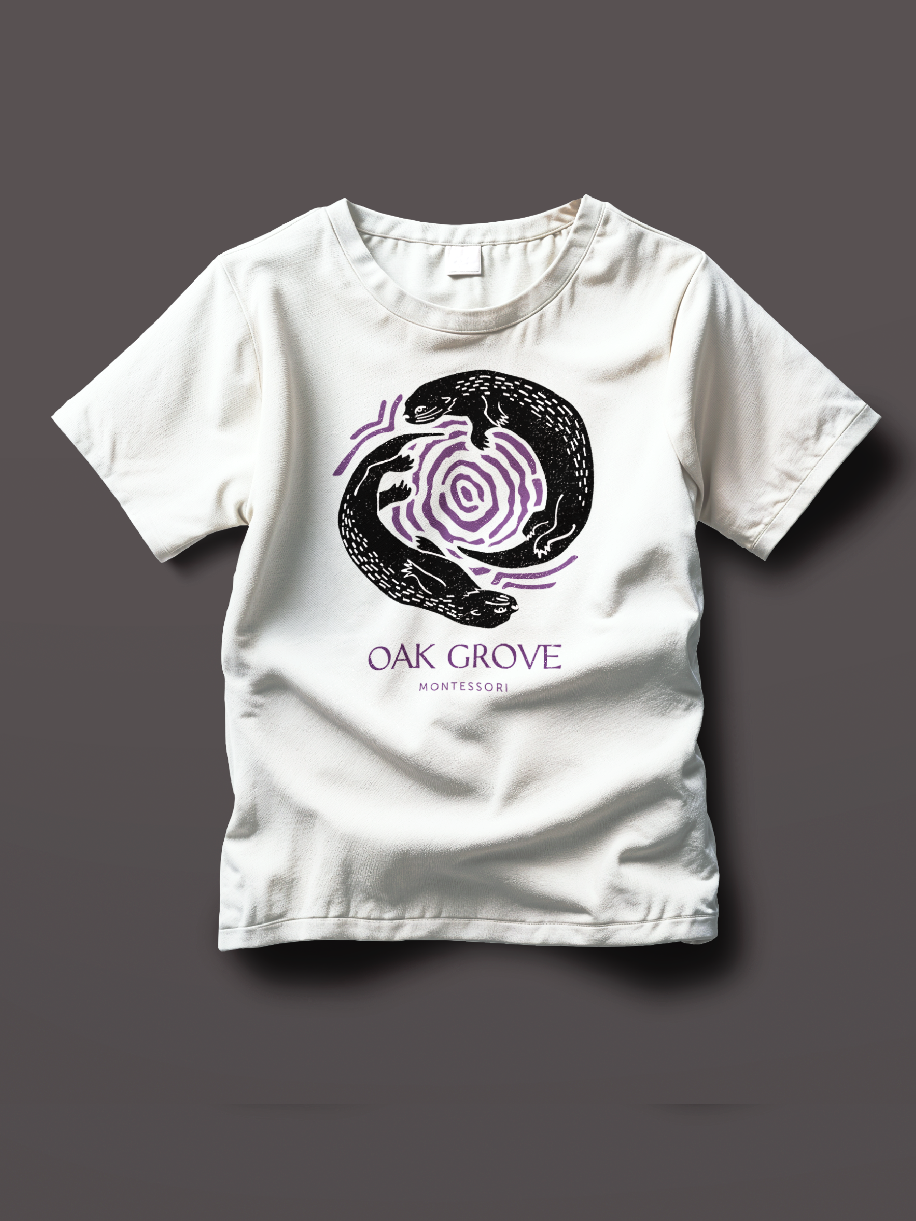
The visual identity draws from the natural world and the tactile experience of Montessori learning. A grounded palette, expressive typography, handmade textures, and custom linocut-inspired illustrations create a brand that feels thoughtful, welcoming, and distinctly handmade.
OBJECTIVE
Oak Grove had a well-established brand strategy and values system, but their existing visual elements weren't capturing the warmth and reputation of the school. Together, we built a cohesive brand system that embodies the spirit of Oak Grove while remaining versatile enough for real-world applications and the school's next chapter.
BRAND KEY WORDS
NATURAL
HANDCRAFTED
CURIOUS
GROUNDED
JOYFUL
TIMELESS
WELCOMING
first things first
DESIGN DIRECTION
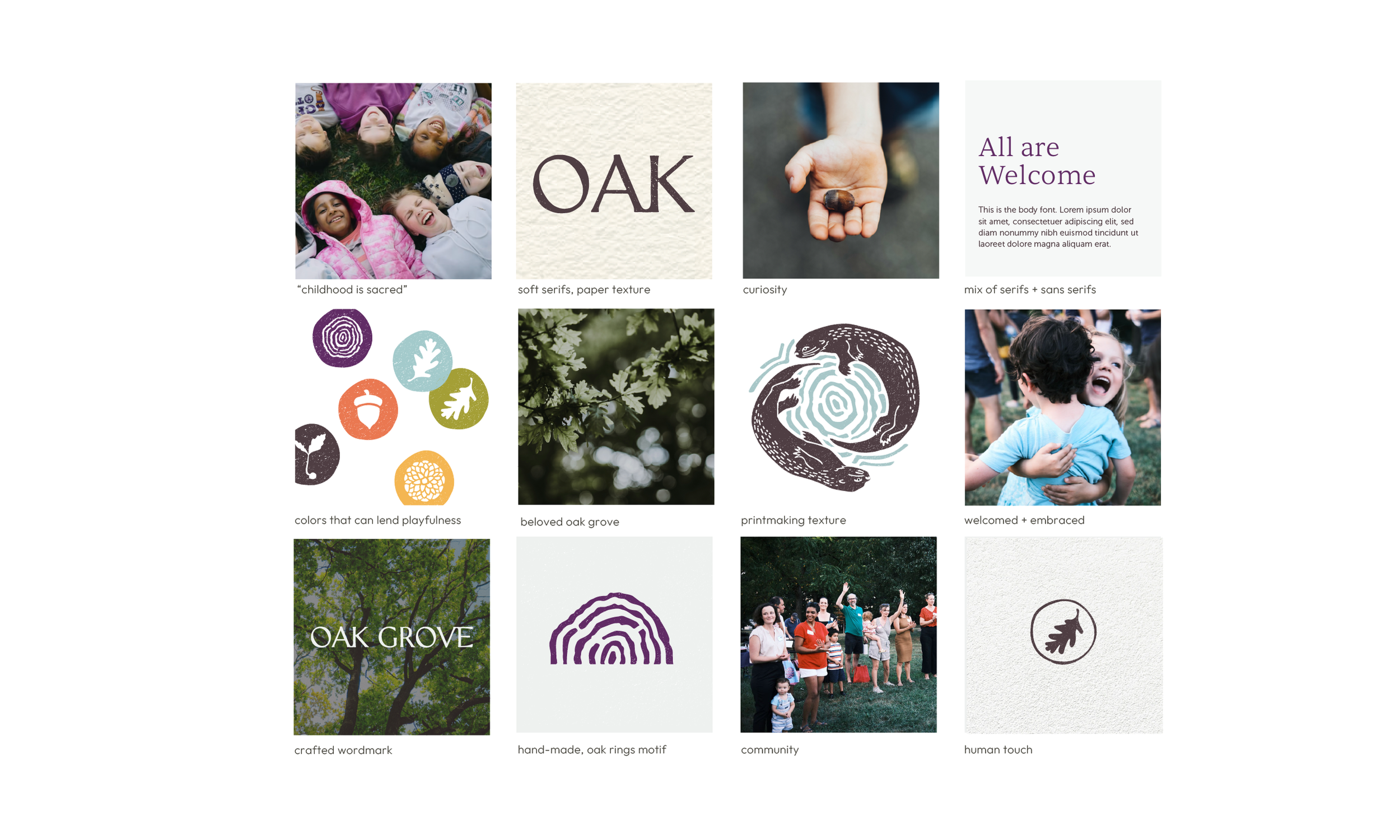
Before beginning design, we established a visual strategy rooted in the heart of the brand: community, curiosity, and the sacredness of childhood. We explored visual elements that could communicate these ideas while honoring the school's established character. With this alignment and clarity in place, the design direction emerged naturally.

strategic design
THE VISUAL IDENTITY
Oak Grove's visual identity is designed to feel like an extension of the learning environment itself: calm, welcoming, and thoughtfully crafted.
Handcrafted illustrations, natural textures, organic forms, expressive typography, and a versatile color palette work together to create a cohesive and recognizable brand experience. Rather than leaning corporate or overly playful, the identity communicates quiet confidence with a sense of warmth, curiosity, and room for discovery.