portfolio highlight
TEMPLE HONEY HEALING
OVERVIEW
This brand was created for a Reiki practitioner and herbalist offering gentle, holistic support through energy work and handcrafted plant remedies. Her work sits at the intersection of care, ritual, and restoration, with a focus on creating a calm, trustworthy experience.
OBJECTIVE
To create a brand that feels calm, approachable, and easy to engage with, lowering the barrier for those new to energy work and herbal healing. The goal was to balance accessibility with refinement, building trust while honoring the quiet nature of the work.
BRAND KEY WORDS
HEALING
APPROACHABLE
BALANCE
GROUNDED
HOLISTIC
COMMUNITY
NATURAL
first things first
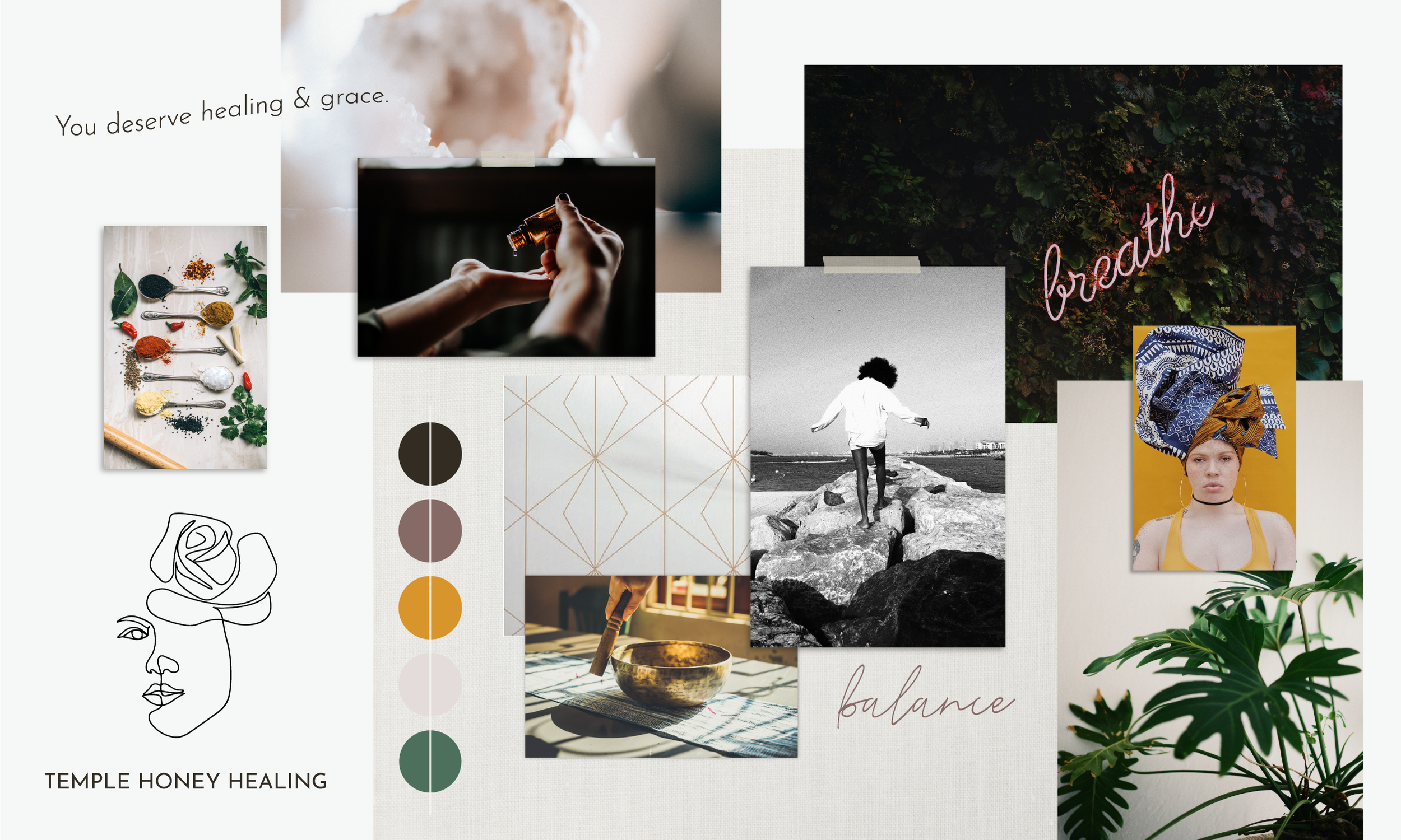
BRAND CLARITY + DIRECTION
Before design, we defined the foundation of the brand:
WHO IT’S FOR
A client seeking calm, balance, and meaningful support without overwhelm
HOW IT FEELS
Gentle, steady, and quietly confident
WHERE IT’S POSITIONED
Rooted in care, intention, and trust rather than trend or performance
This clarity ensured that every visual and verbal decision felt aligned and purposeful.
The moodboard is the first step in visualizing the brand, creating alignment and clarity before beginning the design process.

strategic design
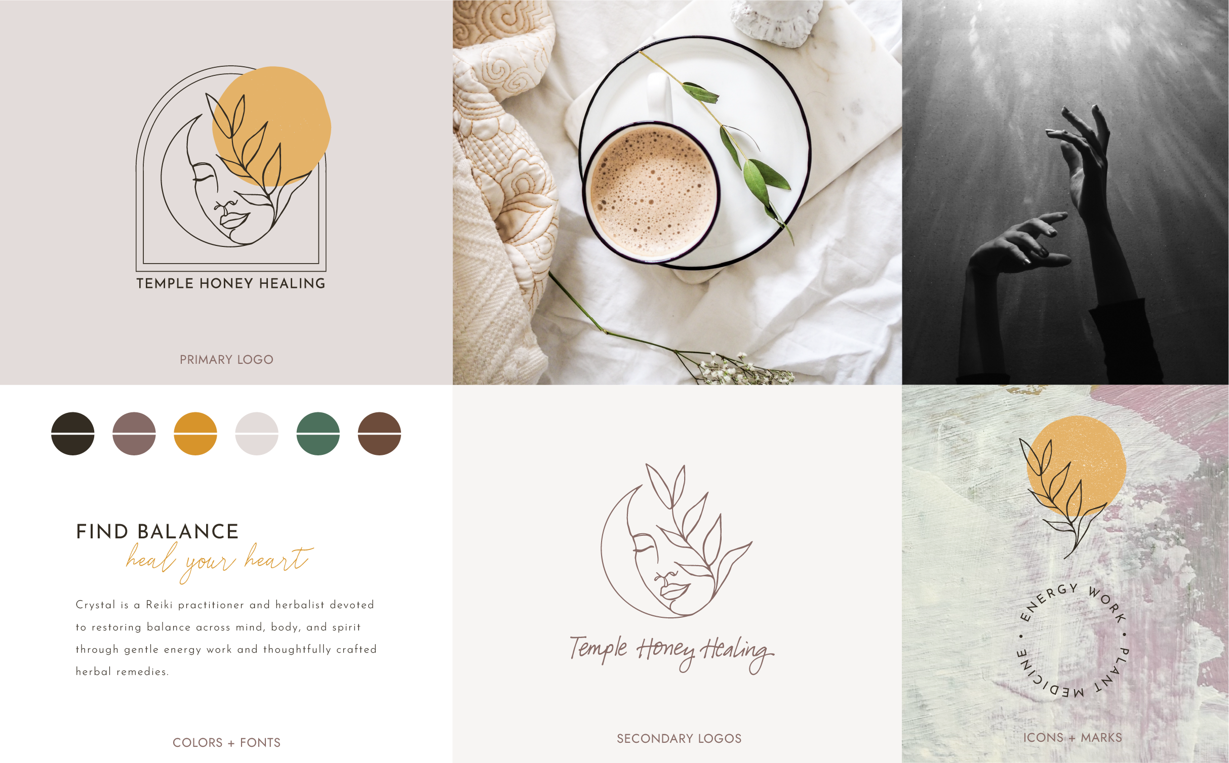
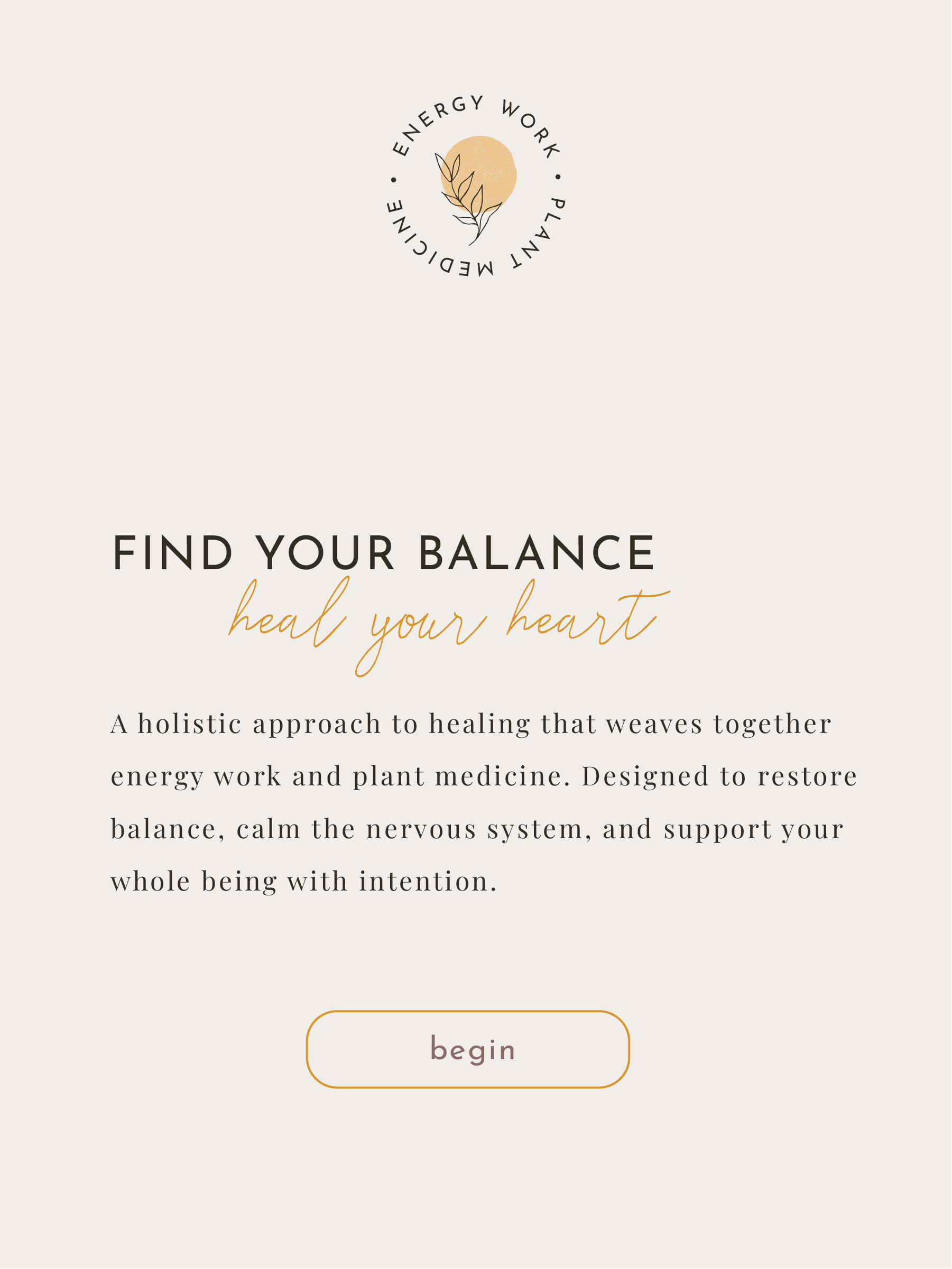
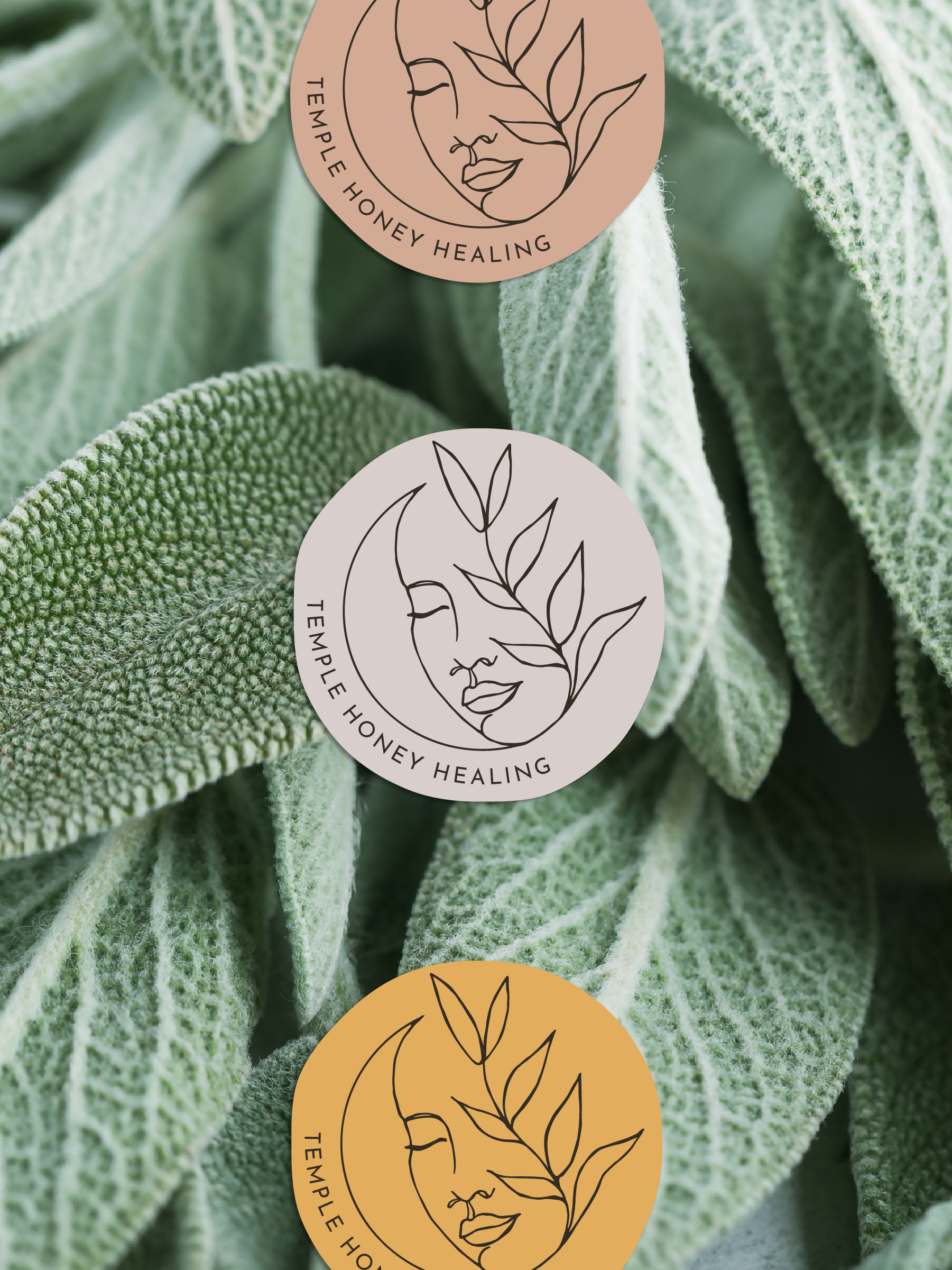
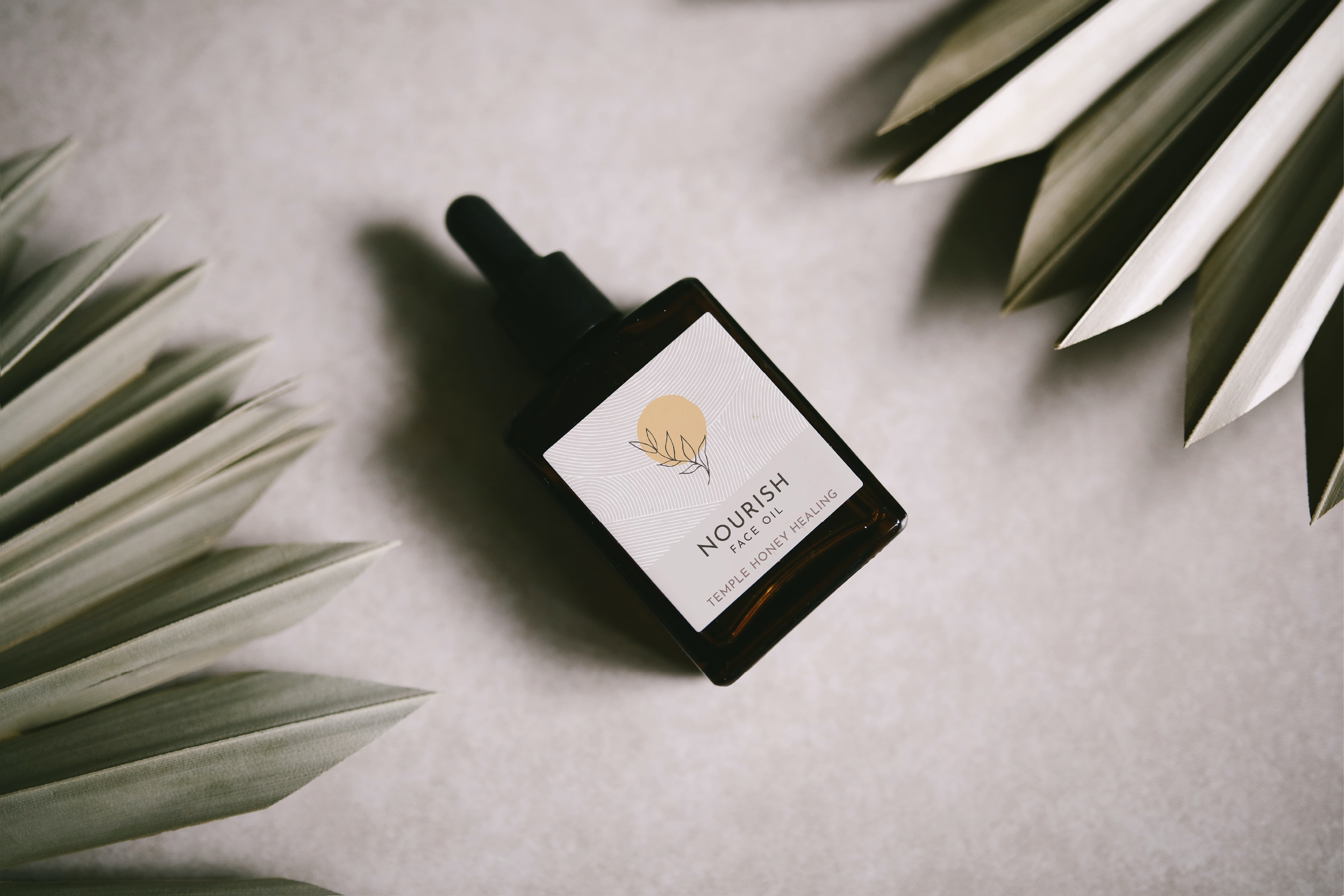
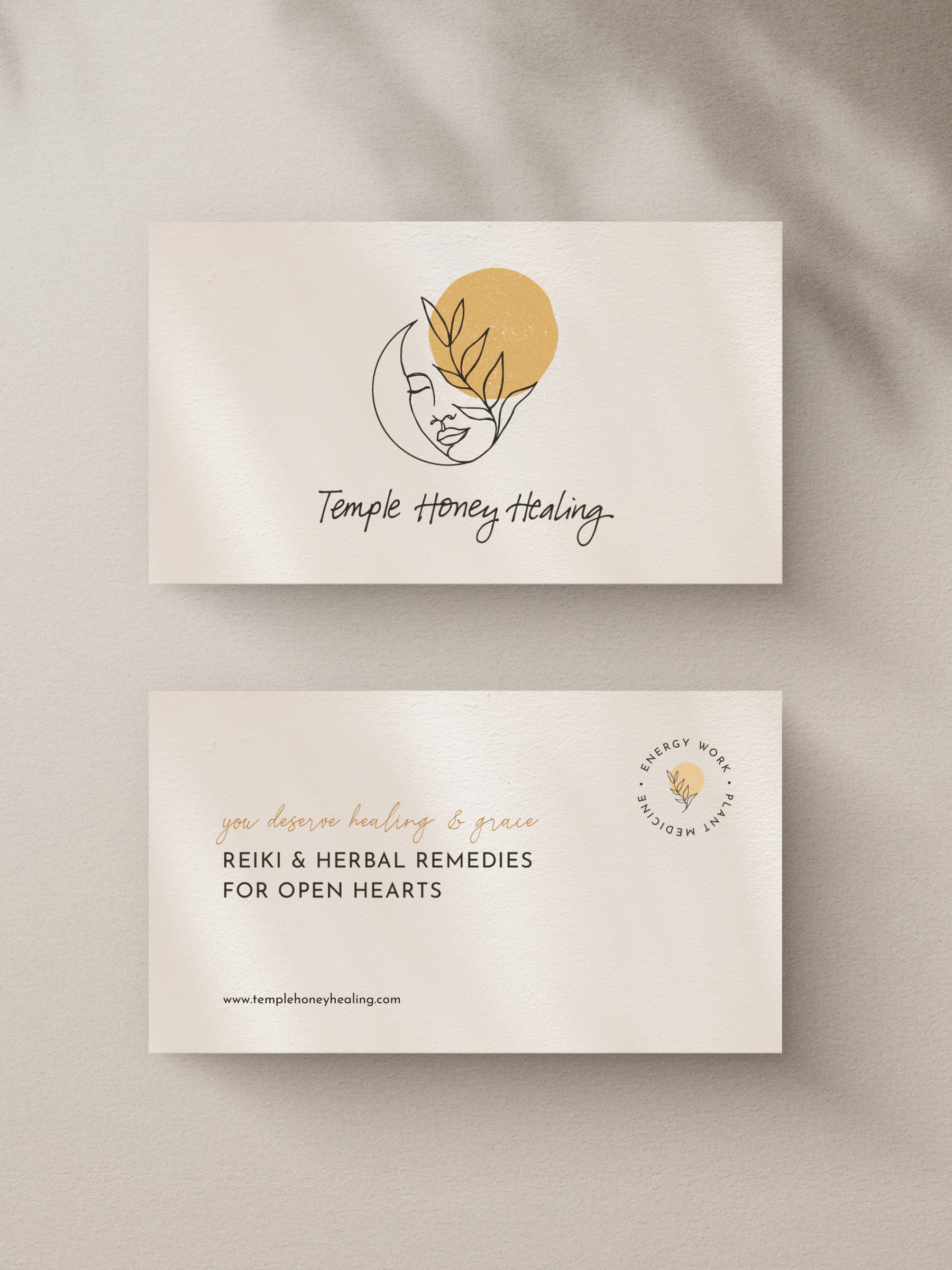
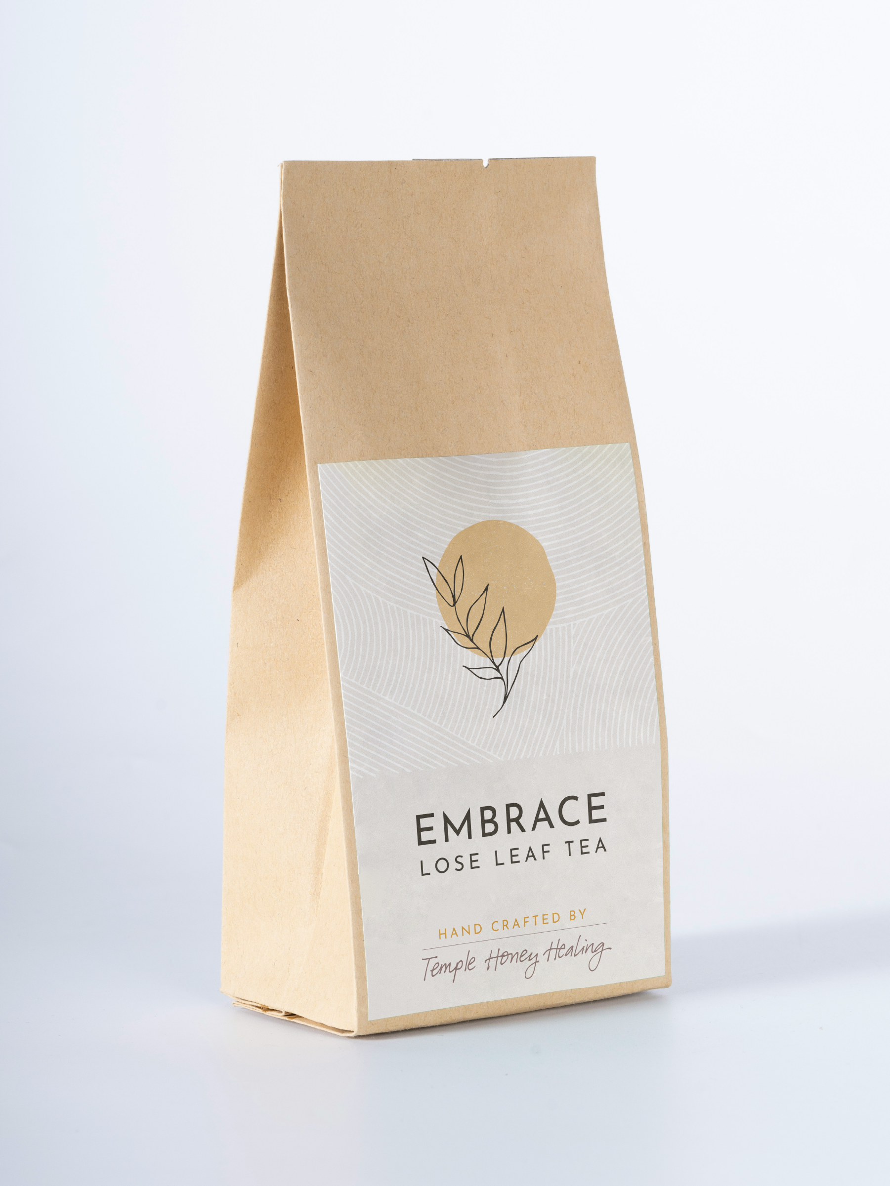
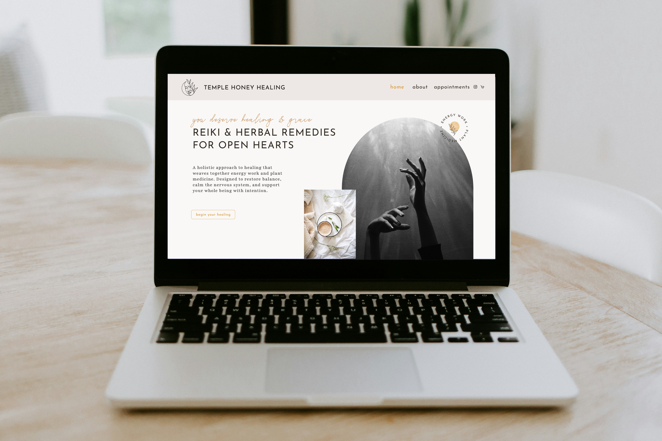
THE VISUAL IDENTITY
The visual identity was designed to reflect softness, balance, and ease.
An earthy palette, organic textures, and considered typography create a sense of calm while maintaining a level of refinement that builds trust. The result is a brand that feels quiet but assured, designed to hold space rather than compete for attention.